Deciding on the best website fonts means choosing ones that fulfil a lot of important jobs. The ideal website font supports your brand, is easy to read, and works across different devices – on a variety of browsers and different screen sizes.
The fonts you use on your website have a big impact on its design. They directly influence how your brand is perceived and how users interact with your site.
Choose the wrong fonts and your users will struggle to navigate through your website and may come away with a negative view of your brand.
Here, I’ll cover some of the important things to look out for when choosing fonts for your website, including:
- Choosing fonts that are accessible (and where to get them)
- Examples of fonts that work well on websites
- A checklist to help you choose the best fonts
First up: what do we mean by, “font” and why are fonts such an important part of your website’s design?
Fonts: what are they and why do they matter?
To format the text on your website, you use fonts. You may be familiar with Arial, Helvetica and Times New Roman for example.
Your font choice is important for your branding – helping convey your brand values and personality. Fonts also impact how effectively people can view and navigate your website.
Back in 2007, Microsoft decided it was time to move away from Times New Roman, 10 pt as the default font for Microsoft Word. The replacement? Calibri, 11pt.
This change partially reflected Microsoft’s desire to modernise its brand – Calibri is larger, rounder, and more modern looking than Times New Roman:
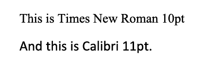
But it’s also a bit easier to read on a screen compared to Times New Roman.
Microsoft recognised users were gravitating away from reviewing documents in print and toward doing so on their computers. This drove Microsoft to choose a font better suited to screens, and Calibri fitted the bill.
Times New Roman also used to be the default font on websites. But there are lots of other fonts you can choose from now too.
So let’s take a look at some of the common ones and how they can help convey your brand identity.
Common font categories and their impact on branding
Most fonts broadly fit into one of five categories: serif, sans-serif, monospace, cursive or display.
Each of these will give your website a different feel.
Tip: It’s generally best to steer away from cursive and display fonts on your website. They are typically harder to read than serif, sans-serif or monospace ones, so should be used sparingly – if at all.
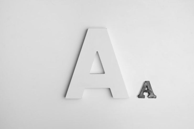
Serif fonts

Serif fonts have extra strokes or lines on the tips of letters. They include fonts like Times New Roman and Courier, and can help evoke a classic, nostalgic and/or trustworthy feel.
Sans-serif fonts
Sans-serif fonts have plain letter endings with no strokes or lines. They include fonts such as Arial, Verdana and Calibri. Sans serif fonts can evoke a clean, modern and/or minimalist look.
Monospace

Monospace fonts include Courier and Inconsolata. Their letters all take up the same amount of space, just like typewriters used to do. They are often used to create a minimal or nostalgic feel.
Cursive
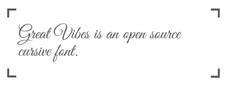
While cursive fonts can be beautiful to look at, they can also be quite difficult to read. They can evoke many different feelings depending on the style, including classical, personal, or casual.
Display

Display fonts are designed for use in larger sizes. They tend to be distinctive and can be useful in, for example, a logo to tie in closely with your brand. They come in many different styles, including hand drawn, abstract and distressed.
Choosing accessible fonts
Whatever fonts you use, you’ll want to ensure they’re accessible to as many people as possible. And an important part of accessibility is ensuring your fonts are readable.
The good news is: if you opt for a serif, sans-serif or monospace font, it’ll likely be readable as readability is usually a core consideration when people create fonts.
But there are still some additional checks you should do:
- Are the letters easy to distinguish?
- Does it have appropriate spacing? Not too close together but not too far apart.
- Does it come in both upper and lowercase letters?
- How does it look on smaller devices like mobile phones?
- Do many of the letters have decorations? The more decorative, the harder to read – especially with longer passages of text.
What to watch out for when you’re using fonts
Because there’s a lot of flexibility around how you can use fonts, a seemingly good choice can still end up badly.
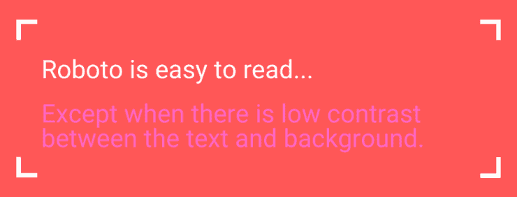
For example, the sans-serif font, Roboto may in theory be highly legible, but not so if it’s used low contrast:
With that in mind, let’s look at some of the other important things to do if you’re going to ensure your website fonts remain accessible:
- Limit the number of fonts used: too many different ones make a website difficult to read.
- Bigger is often better: ensure your font sizes are big enough for people to read.
- Limit font variations: limit your use of bold, italics and UPPERCASE.
- Use sufficient colour contrast: check the contrast between your text and website background so your text is readable.
- Check accessibility across devices: don’t forget to check your fonts are accessible on mobile and tablet, as well as on desktop or laptop computer, and adjust them if needed.
- Use real text, not images of text: otherwise people who use screen readers won’t be able to read your website.
Whatever fonts you choose, there also needs to be a process in place to ensure they display correctly when users access your website.
Using fonts on your website
Websafe fonts are often a good choice as they’re available on the vast majority of modern devices. This means it’s highly likely they’ll display correctly, regardless of what device someone uses to access your website.
The following fonts are websafe [Source: Hubspot]:
- Arial
- Verdana
- Trebuchet MS
- Times New Roman
- Didot
- American Typewriter
- Andale Mono
- Courier
- Bradley Hand
- Luminari
If you use a font that isn’t websafe, that’s fine too. But it should be uploaded to your website so it displays properly.
Even if you are using a websafe font, you can still upload it anyway – in case of the rare instance someone doesn’t have it installed on their device.
Web developers can also code a list of alternative fonts a website can use, should the first choice be unable to display for any reason. If the preferred choice is Helvetica, Verdana could be coded in as an alternative option if Helvetica doesn’t load correctly.
Because Verdana is similar to Helvetica, this limits the impact on your website design.
Currently, one of the easiest and best ways to view, test and download fonts is from Google Fonts.
With Google Fonts, you can easily view and test open-source fonts in one place. You can also download them for use on your computer or upload them to your website.
And the licensing is highly transparent, so you can see at a glance where and how you can use the fonts. Most are under the Open Font or Apache licenses, which allow you to use them for free across print or digital.
Using different fonts to create a different brand feel
So we know different fonts can create different feels – let’s see that in practice with a few examples:
Brand feel: Clean, minimalist
Sans-serif font for titles: Helvetica Neue
Sans-serif font for paragraphs: Muli.
Brand feel: vintage
Serif font used in titles: Roboto Slab.
Sans-serif font used in paragraphs: Roboto.
Brand feel: education, modern

Serif font used in titles: Noto Serif.
Sans-serif font used in paragraphs: Lato.
Brand feel: family-friendly
Serif font used in titles: Libre Baskerville.
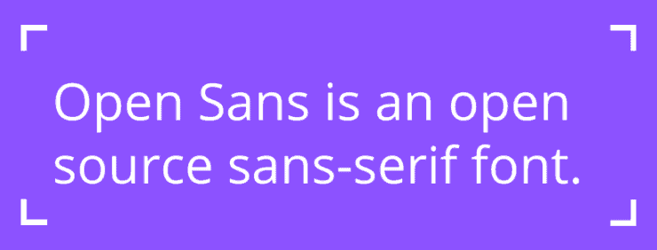
Sans-serif paragraphs: Open Sans.
How to choose the best fonts for your website
There’s a lot to consider when choosing the best font for your website.
To make this decision easier, here’s a quick checklist you can use to help decide whether your website fonts are right for your brand:
- Do they look good?
- Do they evoke the right feeling for your brand?
- Are they easy to read?
- Do they work well in the sizes you need?
- Will you need to use them in print too – if so do they meet all the above criteria when printed?
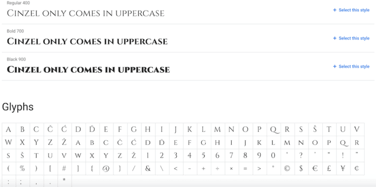
- Are all the glyphs (i.e. characters and symbols) you need available?
- Are they accessible on all devices?
If the answer to any of these questions is no, then it could be time to reconsider your font choices!
As with all things web design, we’re here to help you make these big decisions and narrow down your choices. So don’t hesitate to get in touch if you’d like to talk it through.
 A new normal for Callia Web
A fantastic read. Thank you!