When you’re gathering images for your website, it’s easy to assume you can just use photos straight from your phone or camera. In reality, websites often need images in a wide range of shapes and sizes, and we crop the images you give us to make the shape we need.
Understanding this early on will save time, avoid awkward cropping, and help your site look polished and professional.
It’s not just about size, it’s about shape
Most cameras and phones take photos in a standard rectangular format (usually 3:2 or 4:3). But websites use a variety of aspect ratios depending on where the image appears.
Think wider than you need
For large, full-width header images (often called “hero” images), we typically use a very wide, shallow shape often around a 4:1 aspect ratio. I call this “letterbox” shape.
That means:
- The image will be much wider than it is tall
- The top and/or bottom will be cropped off
If your original photo is tightly framed (for example, a close-up portrait) it can’t be used for the header image.
What to do instead:
- Take a step back when shooting
- Leave space around your subject
This gives us room to crop without losing anything important.
You don’t always need to centre the subject
It’s natural to place your subject in the middle of a photo — but for websites, it can often look better to have them slightly to the left or right.
This creates useful empty space that we can use in the design, for example:
- Adding headings or call-to-action text
- Improving the readability of the text over the image
- Creating a more balanced, modern layout
So feel free to:
- Position your subject off-centre
- Leave clear space on one side of the image
- Think about where text might sit
Allow space on the sides too
Websites also use square images (1:1 aspect ratio) in many places — for example:
- Team photos
- Blog thumbnails
- Service blocks
To create a square, we often crop from the left and/or right of an image.
If your photo is tightly framed edge-to-edge, this can be tricky.
Tip:
- Leave breathing space on both sides
- Avoid filling the entire frame
We can crop, but we can’t add
A simple but important point is that we can always crop an image down, but we can’t add extra space if it isn’t there.
If a photo is too tightly framed, there’s no easy way to “extend” the background or recover missing edges without it looking unnatural.
That’s why it’s always better to:
- Shoot slightly wider than feels necessary
- Include extra space around your subject
- Give flexibility for different crops
Don’t worry about losing quality
Modern cameras and phones take photos at very high resolutions (large number of pixels). That’s far bigger than what’s needed for a website.
This means:
- Even after cropping, your image will usually still be more than large enough
- You don’t need to worry about “wasting pixels” when you leave extra space
- A well-composed, flexible image is far more valuable than a tightly cropped one
In fact, images used on websites are typically reduced in size to keep pages fast-loading. So starting with a larger image actually gives us more flexibility.
Some examples:
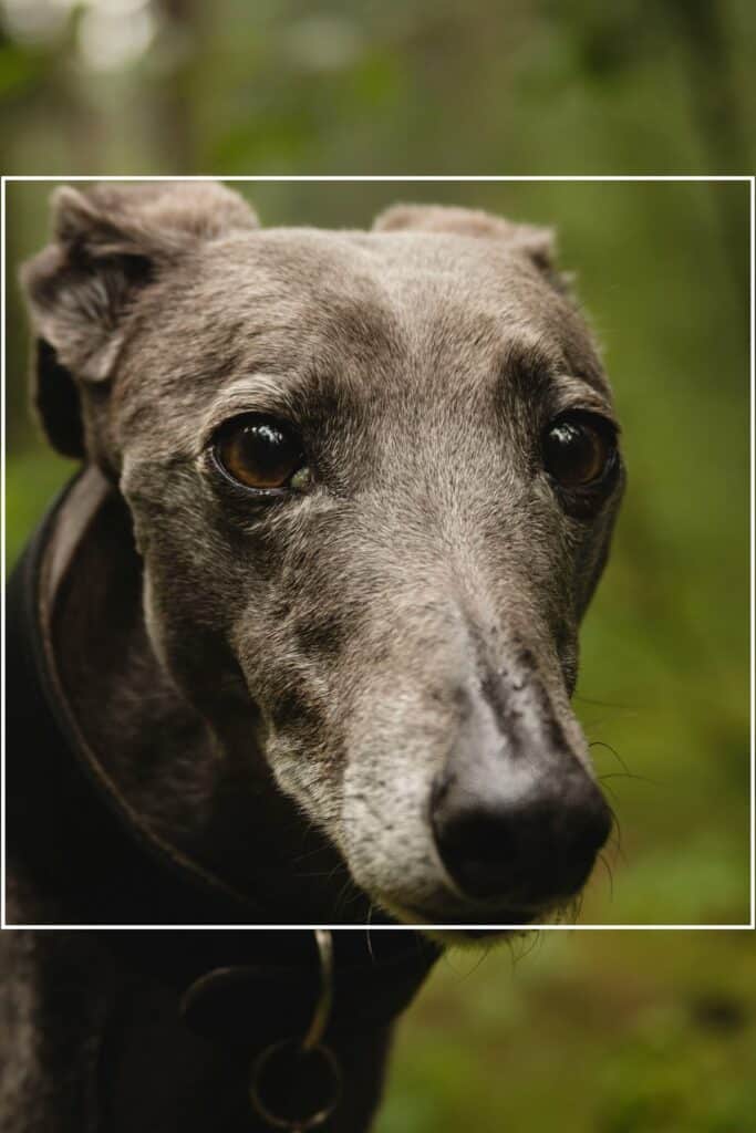
1. Too close image
Here is a lovely picture of a greyhound taken by Jannik Selz from Unsplash, but the image subject fills the frame. I can’t make a square crop of this image (white line). I can only use this image in its original portrait shape.
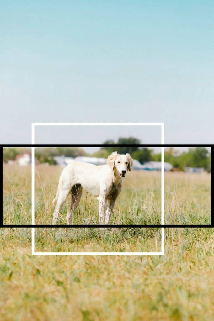
2. Lots of space around the subject
Here is also a portrait image of a Saluki lurcher taken by Dana Sarsenbekova from Unsplash. As there is a lot of space around the subject, I can not only create a square image (white line), I can also take a near 3:1 crop (black line), which would be ideal for a header image.
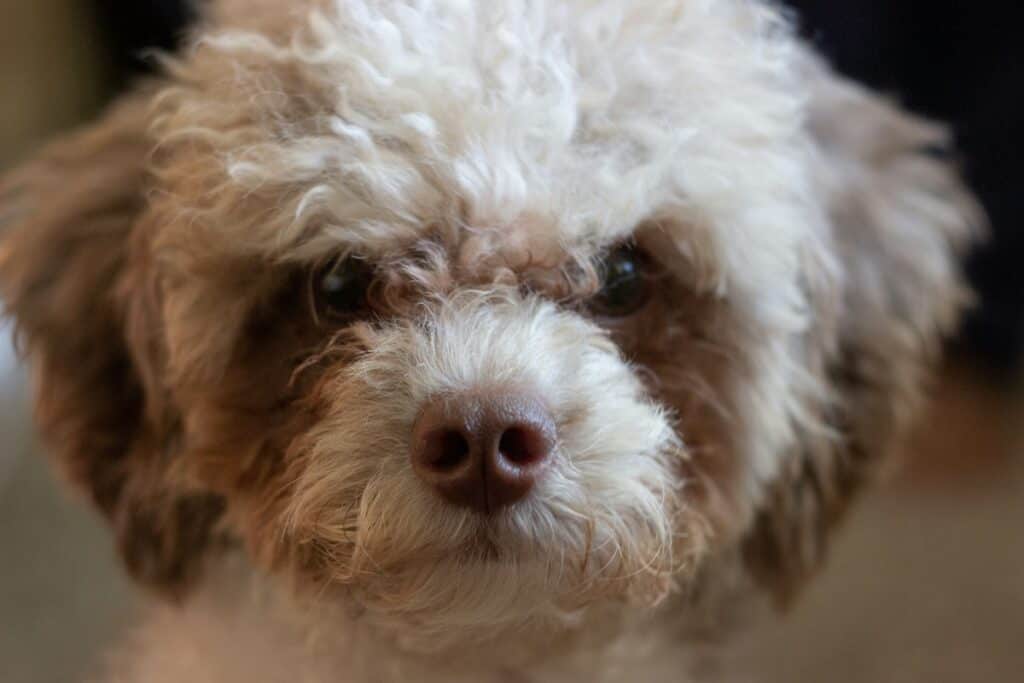
3. Too close image
This enchanting close-up image of a poodle-mix dog by Ashley Anthony from Unsplash can only be used at this aspect ratio.
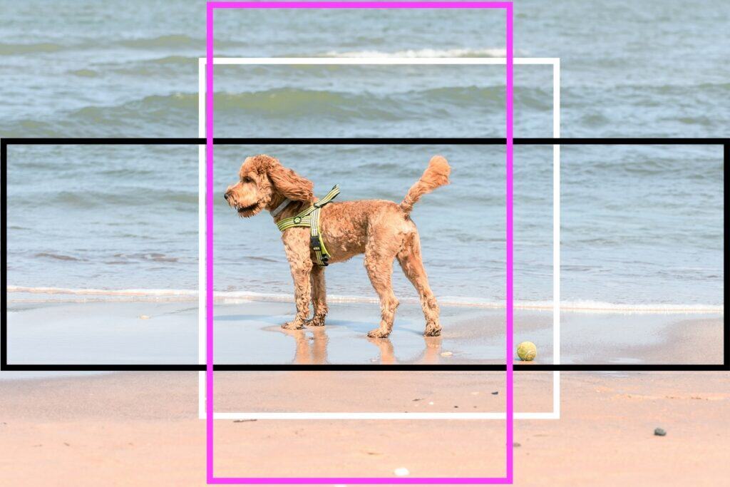
4. Lots of space around the subject
This landscape photo by Anastasiya Badun of a cockapoo on a beach can be cropped square (white line), header image (black line) and even portrait (pink line).
Keep your galleries consistent
If you’re providing images for a gallery, consistency makes a big difference.
Mixing portrait, landscape, and square images can look messy and uneven.
We can autocrop images to make them all square, but sometimes the cropping takes out an important part of the picture. Please read this post about making images all the same size in WordPress.
For the best results, choose one format and stick to it:
- All portrait (tall images)
- All landscape (wide images)
- Or all square
This creates a much cleaner, more professional layout.
A simple rule of thumb
When in doubt, give yourself more space than you think you need.
- Don’t crop too tightly when taking the photo
- Keep important details away from the edges
- Think about how the image might be reshaped later
It’s much easier for us to crop an image down than to fix one that’s already too tight.
If you’re ever unsure, feel free to send a few sample photos before taking a full set — we can quickly let you know if they’ll work well for your website.
 Introducing Made for Words — a New Home for Writer Websites
Leave a Reply